A lightweight and rating component for React Native that works with most widely used icon libraries such as Lucide Icons and Expo Vector Icons. You can also use custom SVG icons.
Zero dependencies. Full example available at: example.tsx
Install the Component with simple npm install command. No extra peer dependencies just react and react-native.
npm install react-native-vector-ratingThen use the Rating component by importing it in your application.
import { Rating } from "react-native-vector-rating";You can use Lucide Icons and Expo Icons with this component. Just pass the Icon you want to use as an instance in the icon prop.
import { Rating } from "react-native-vector-rating";
import { Star } from "lucide-react-native";

export default function MyComponent() {
    return <Rating icon={<Star />} />;
}
Or If you are using Expo Icons:
import { Rating } from "react-native-vector-rating";
import { AntDesign } from "@expo/vector-icons;

export default function MyComponent() {
  return (
    <Rating
      icon={<AntDesign name="star" />}
    />
  );
}This Component works much like a regular input and allows both controlled and uncontrolled instances. You can set defaultValue, valueand onChange much like regular Input Component.
import { Rating } from "react-native-vector-rating";
import { Star } from "lucide-react-native";

export default function MyComponent() {
    return (
        <Rating
            size={30}                   // Size of individual icon
            gap={2}                     // Gap Between Two Icons
            color={"blue"}              // Color of the Icon - filled / rated
            emptyColor={"black"}        // Color of the Icon - unfilled / not rated
            icon={<Star />}             // Icon Component
            defaultValue={3.5}          // Starting Value this can be fractional too

            // When User presses a rating then we get a new value
            onChange={(value: number) => {
                console.log("Rating Value: " + value)
            }}

            // In case Of Controlled Component - where you want to useState to manage value
            value={3}                   // Whatever Value You want to use
            // If You want to disable the rating or only use to display ratings then set disabled to true
            disabled={false}            // No Need to use this unless you want to set it to true
        />
    );
}| Prop | Type | Default | Description |
|---|---|---|---|
value |
number |
— | Controlled rating value |
defaultValue |
number |
3.5 |
Initial value (uncontrolled) |
icon |
Icon Element |
Fallback Star | Icon element to render |
size |
number |
20 |
Icon size (width & height) |
gap |
number |
0 |
Space between icons |
count |
number |
5 |
Total number of icons |
color |
string |
undefined |
Active icon color override |
emptyColor |
string |
"gray" |
Inactive icon color |
disabled |
boolean |
false |
Disables user interaction |
onChange |
(value:number)=>void |
— | Callback when rating changes |
const [rating, setRating] = useState(2);

<Rating value={rating} onChange={setRating} icon={<Star />} size={40} />;<Rating
defaultValue={4}
icon={<Star color="purple" />}
color="gold"
size={35}
/>import { AntDesign } from "@expo/vector-icons";
<Rating icon={<AntDesign name="star" />} size={30} />;import { MoonStar } from "lucide-react-native";
<Rating icon={<MoonStar />} size={35} color="blue" gap={2} />;import { Award } from "lucide-react-native";
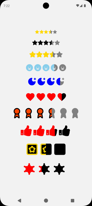
<Rating icon={<Award color="black" fill="#ff4500" />} size={45} count={6} />; {/* Fall Back Rating (Made Using View) */}
<Rating />
{/* Expo Icon - With Size */}
<Rating size={25} icon={<AntDesign name="star" />} />
{/* Lucide Icon - With Size and Color */}
<Rating size={30} color="gold" icon={<Star />} />
{/* Expo Icon - With Size, Color and Gap*/}
<Rating size={35} color="skyblue" gap={2} icon={<Ionicons name="happy" />} />
{/* Lucide Icon - With Size, Color, Gap and Count */}
<Rating size={40} color="blue" gap={2} count={4} icon={<MoonStar />} />
{/* Expo Icon - With Size, Color, Gap, Count and Empty Color */}
<Rating
size={45}
color="red"
gap={2}
count={4}
emptyColor="black"
icon={<MaterialCommunityIcons name="heart"/>}
/>
{/* Lucide Icon - With Size, Gap, Count, Empty Color and Icon Styling */}
<Rating
size={50}
gap={2}
count={6}
icon={<Award color={"black"} fill={"#ff4500"} />}
/>
{/* Expo Icon - With Size, Gap, Count, Empty Color, Icon Styling, defaultValue and onChange */}
<Rating
size={55}
gap={2}
count={4}
emptyColor="black"
icon={<FontAwesome name="thumbs-up" color={"red"} />}
defaultValue={2.7}
onChange={(v) => {
console.log("Logging New Ratings from Uncontrolled Component: ", v);
}}
/>
{/* Lucide Icon - Controlled - With Size, Gap, Count, Empty Color, Icon Styling and onChange */}
<Rating
size={60}
gap={2}
count={3}
emptyColor="black"
icon={<SquareStar stroke={"gold"} />}
value={controlledRating}
onChange={(v) => {
console.log("Logging New Ratings from Controlled Component: ", v);
setControlledRating(v);
}}
/>
{/* Expo Icon - Disabled - With Size, Gap, Count, Empty Color and Icon Styling */}
<Rating
size={65}
gap={2}
count={3}
value={1.2}
emptyColor="black"
icon={<Foundation name="sheriff-badge" color={"red"} />}
disabled={true}
/>The above code as shown before will render these Rating components:
MIT © devMadhava